Like I did for my magazine cover I will now research contents pages to help me create my own.
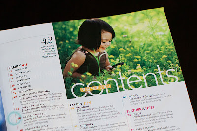
I like how the photograph and the word contents is positioned. This particular is similar to one of my magazine cover examples to the fact that it does not have a full view of the page; however I like the colours that have been used, I personally think that they blend well together. Light subtle colours which make the page look quite attractive. Subtitles are in bold so it is clear to know what each section is about however the individual page numbers and titles are very small making it hard to read. The purpose of the contents is promote what is inside the magazine. If it the contents is difficult to read this might out of the reader off the whole magazine. So to improve this page the designer could increase some of the font. I think the simplistic looks very good and it is not too overcrowded.This is one of my favourite designs and example. It is quite simple and something I think I can personally achieve. The black and white photograph works very well and the gold and reds used for the title and subtitles makes it sound out and easy to read. Unlike the previous example this contents page only covers one page. Depending on how many pages I am going to include in my own magazine will depend the size of the contents page.
With the following photographs I have thought about adding to my contents page, However they need a lot work which can be done through photoshop. This software will allow me to adjust parts of the picture which are necessary. The chosen and finished photos are meant to portray that the school is fun and welcoming.
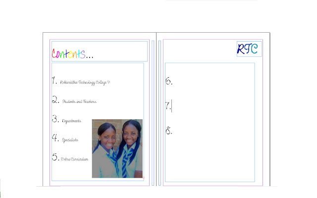
After researching various contents pages and possible photographs for this particular page I then started to put together a possible look for my school magazine contents page. I have included my logo from my fonts research and continued with the theme of the school being a place where you can relax and have fun. Firstly I drew up an idea of what the contents page will visually look like and then used Adobe In Design to try a final copy:After developing the idea further I am cutting my contents page to one page rather than two pages, I have also reconsidered the colours that I am using. I want the colours that I am using for the front cover to correspond with the colours on the contents page below is a print screen on my developed design
Here I have changed my original idea slightly, but is does not apply to the rule of three so would not look as effective as a contents page when finished. I think when applying this rule to my work will allow it to look more professional. below you can see that I have used grid lines to help me place pictures, borders and text boxes.
The previous three print screens shows the development to my final design. I have tried to use the rule of three as much as I can in my work, making my photographs oval and also bordered the pictures which makes them look more dynamic rather just placing three pictures on a page. I continued to use a similar colour scheme to the front cover of my magazine, which would be used throughout the magazine.


