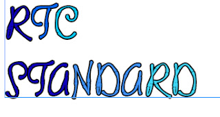
As part of my magazine research, I have been looking at fonts for my magazine. I played around with the various fonts in InDesgin and then came to my final font type. Which will be used for the logo and title for the magazine. The final font I have chosen I feel relates to school as it looks as if it is handwritten, I feel that the look is sophisticated.
In my final font I have used the different shades of blue to match my picture that will be used for my contents page, the uniform used in the pictures are of different shades of blue so this is reflected in my logo. Again it will give it a planned and structured more professionally look. From my magazine research I can see that designers have matched the colours well by picking colours from their chosen image and used the colours on the lay out of the page.


